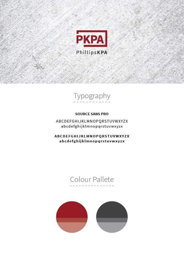

Our brief was to update their existing brand by featuring the PKPA abbreviation as an icon in a modern but formal style. The solid open outline suggests thinking outside the box.
We have moved to a more condensed font but kept their colours similar to retain some continuity with their existing brand.

